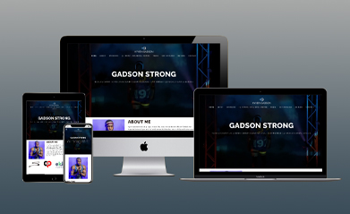
A couple of years ago I was brought in by Cocoa Creative to revamp/improve Team USA Wrestler, Kyvan Gadson's website. Kyven is a NCAA D1 Champion, US Open Champion, 3X World Team Alternate, and 3X All American. View Site
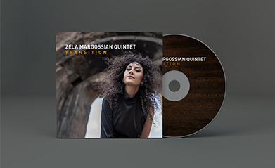
This is the design I did for the debut album of Sydney based world jazz group, Zela Margossian Quintet. I wanted to go for a very clean look with striking photography that invoked a modern yet cultured feel. We went with an all cardboard packaging to avoid plastic trays. This album came out in November of 2018 and was nominated for an ARIA (Australian Recording Industry Association Music Award).
View Project
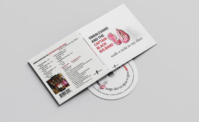
This is the design I did with Christopher Kayfield, photographer extraordinare for Orrin Evans and the Captian Black Big Band's Grammy nominated album. This is the big band's fourth album and their first independetly released album. The album has a more serious tone than prior releases with tunes reflecting Evan's upbringing and health issues. I went with a clean and straight forward design to emulate the tone of the album.
View Project
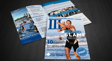
Not too long ago, I was involved with a group who pitched for a new sports magazine called III. It was a magazine devoted to the lifestyles of triathletes and the sport of the triathlon. I came up with the bulk of the branding and identity. I went with Greg Bennett for the cover we pitched with. He was Mr. Triathlon at the time, having won all 3 major U.S. triathlons.
1) View Project 2) View Project 3) View Project
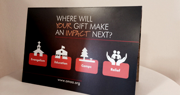
This is a card I designed for AMAA's Fall Appeal. This card is easy to read, airy and not overwhelmed with too much copy. Through the use of an autumn color palette, clean type and bright images, this campaign speaks to the organization's professionalism and its commitment to humanitarian relief and social outreach
View Project
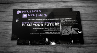
At the request of the Director for NYU's Graphic Communications Management & Technology program, I designed a post card for a direct mail campaign. I wanted to come up with something different from what GCMT tends to release. In comparison I feel this is a bit more appealing, appropriate, and representative of my alma mater's program.
View Project
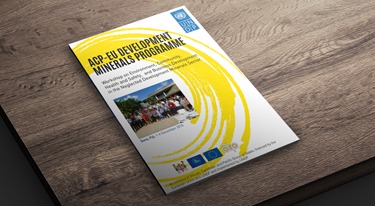
This is a program I designed for UNDP's Mineral Programme seminar. They wanted something clean and legible for a meeting of this kind, but at the same time fresh and aesthetically pleasing.
1) View Project 2) View Project
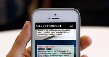
A while back the founders of the now defunct Silvertoungue asked me to come up with the look and feel for their mobile app. Silvertongue was to be the one stop destination for all things pop culture, tech, fashion, and night life for the young urbanite. As the Young the Giant song goes, "I've got that silver tongue. Got that silver, silver tongue."
View Project
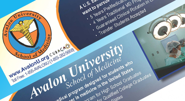
Digital ads... a staple in the good ol' digital age. There's no cookie-cutter formula in designing these. Instead, I blend a brand's vibe with a clean layout and smart techniques that inspire maximum clicks. Like this ad I did a while back for Avalon.
View Ad 1
View Ad 2
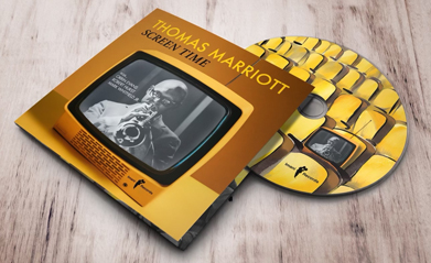
This is the album artwork I did for Thomas Marriott's latest album. It's a collection of covers and reimaginations of movie and television themes. Hence the title, Screetime. For this reason I came up with playful imagery and illustrations that refect the mood of the music. View Project